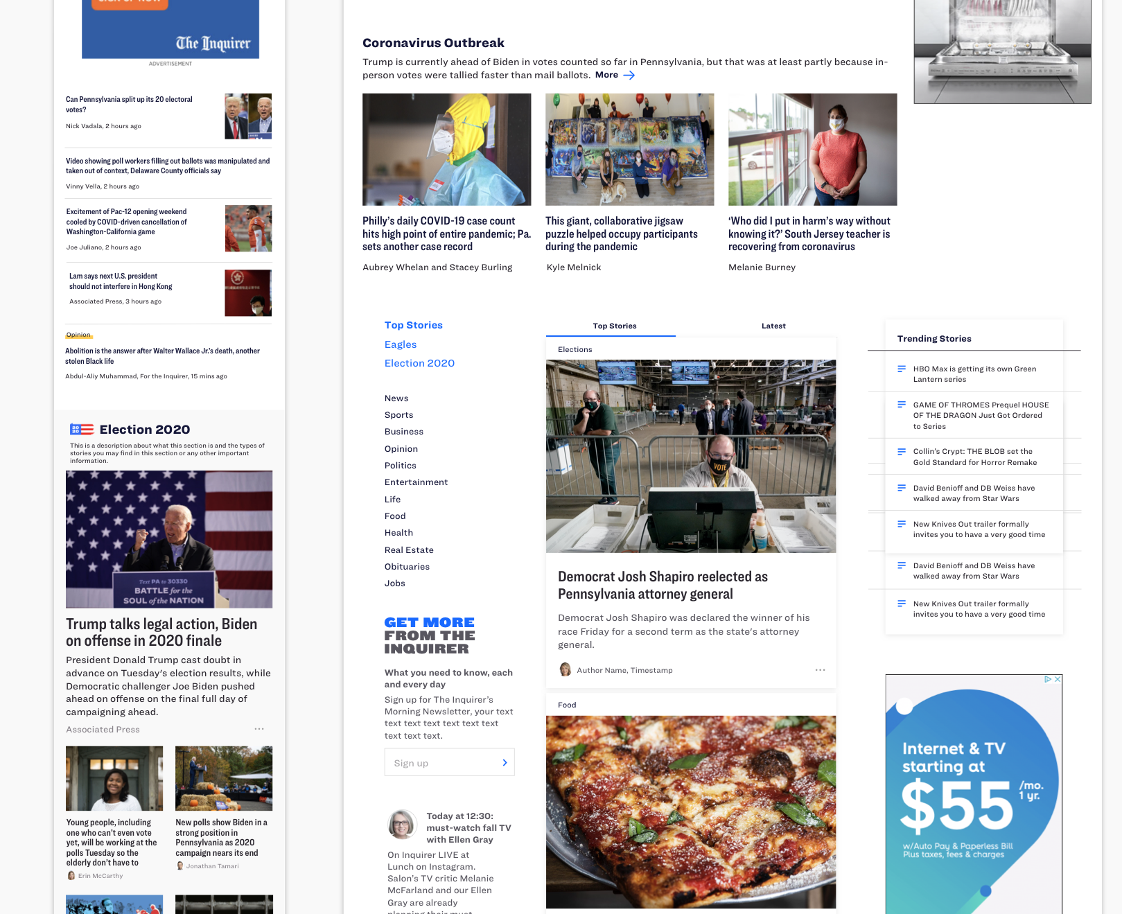
Inquirer 2.0 | Homepage Redesign
Project Overview
As part of the larger Inquirer 2.0 project, the homepage was in desperate need of a redesign. Our user research findings made it clear that our users rely heavily on our homepage to browse articles and find out the latest news for the day.
What additional factors informed our work?
Homepage traffic is the opposite of the rest of the website. It is 67% desktop, 33% mobile. So the emphasis with the homepage needed to be on desktop, which was the opposite of our mobile-first vision
We had a very tight timeline. With moving to a new CMS, we had a hard deadline for cutover and launch of the new homepage. We also needed to ensure enough time for producers to get comfortable with curating the homepage before we could launch to 100% of our audience.
What will success look like?
Increase in recirculation rate and repeat visits
The page load time is much faster than the classic homepage
Ad revenue remains the same or grows
Workflow becomes more efficient for our internal producers
Special thanks to my team:
Designers Ashley MacDonald / Westin Lohne / Lindsay Grow Product Managers Kat Sheplavy / Julie Westphal Engineering Radu Metente Editorial Jessica Parks / Annie Bryan
So, where did we start?
We did qualitative research with 3 current subscribers and 6 non-subscribers about our current homepage. We asked our participants about branding impressions, editorial relevance, first impressions, and asked them to perform specific tasks.
This is what they told us:
Our homepage is nothing special.
“I mean, it’s a newspaper. It's basic, not overly flashy.”
- Participant 6
“It looks similar to any other news sites..”
- Participant 1
Our homepage is disorganized.
“There was a lot of information to digest and therefore, it was somewhat hard to find specific things.”
- Participant 5
Our homepage is text heavy.
“Print is somewhat small and I’m like ‘what does that say”
- Participant 5
Key Opportunities
Knowing the pain points of the current homepage and the business goals we have as a company, I worked with the product managers and editorial team to identify the key opportunities to solve for with the new homepage redesign.
For the External User
Catch up on the latest news
Deepen their understanding of major events
Discover something unexpected from The Inquirer’s wide variety of stories and sections.
Connect with local stories that have an impact on their life.
Have an experience that is curated, but also customizable.
Elegant, clean, more white space
For the Internal User
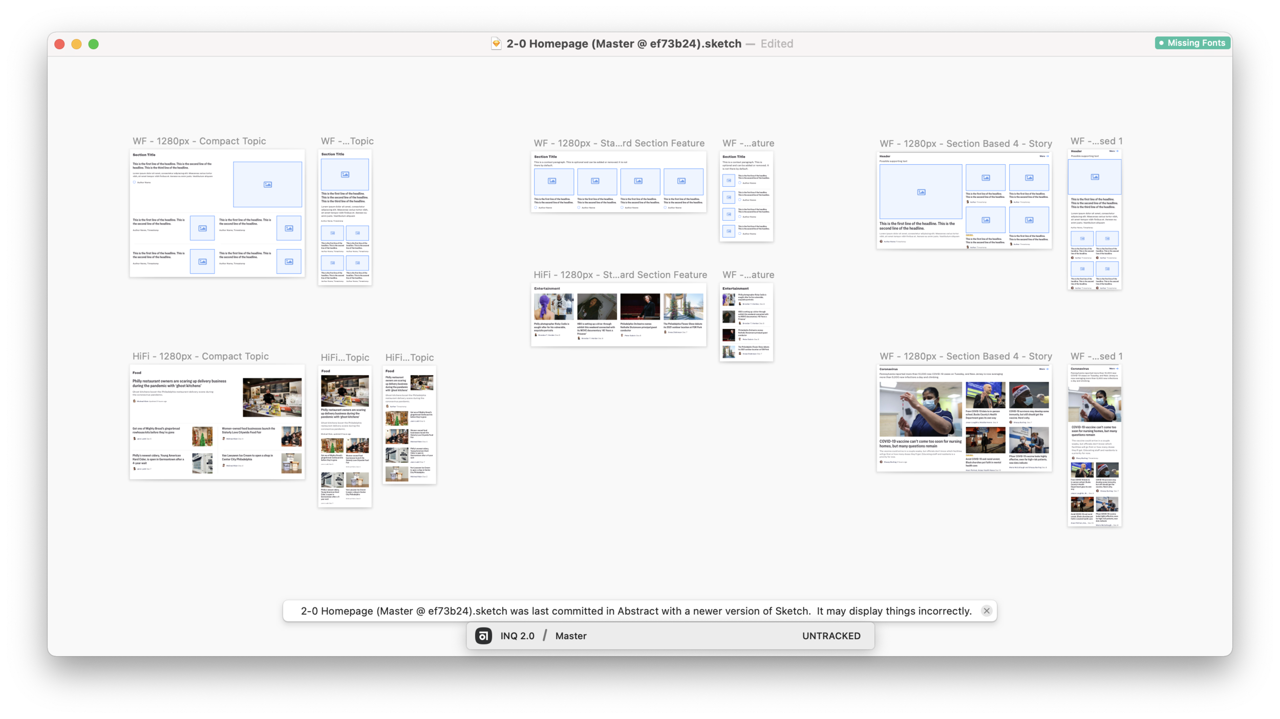
Flexible layouts & packages
Simplified workflow
Monetization
Quality > Quantity when it comes to the ad map
High value sponsorship opportunities that feel native to the experience
Design Exploration
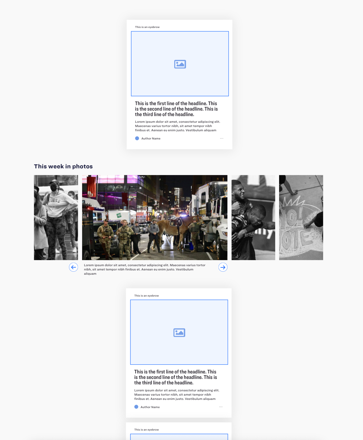
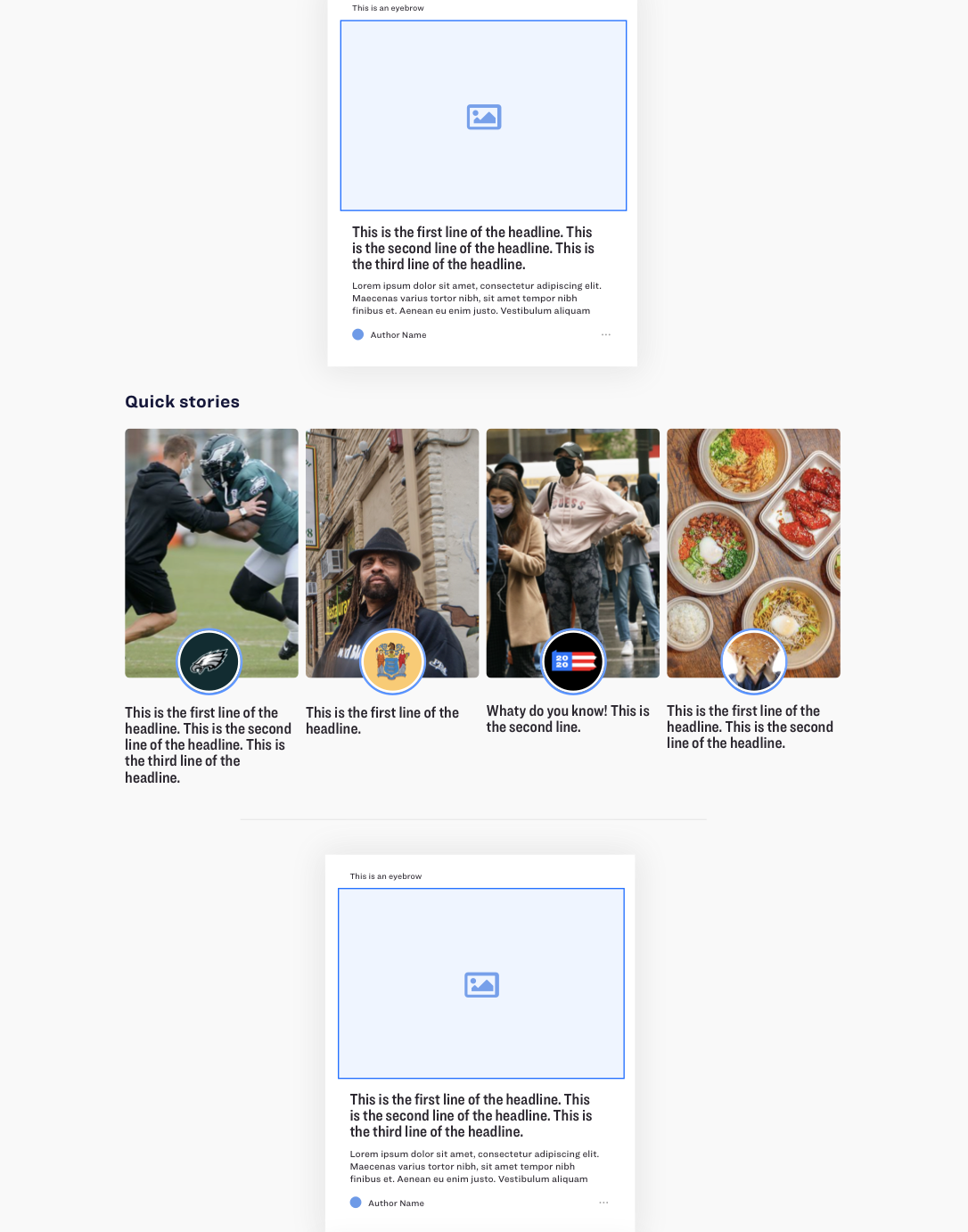
Phase 1: Feed Embellishments
Opportunity:
This gave us the opportunity to expand on our feed concept and introduce lots of new media types and collections of content. This went to our goal of allowing users to discover something unexpected and expand their knowledge on a particular subject.
Challenge:
A majority of our homepage traffic is on larger desktop devices, therefore this is a more mobile-first concept and was a relatively slow way to consume the news. One of our goals was density and the ability for a user to quickly identify news that is relevant and interesting to them and this layout slowed down that process.
But as we started to layout the page with the feed as the focus, the lack of density and slow consumption of the news became a problem for both external users and internal stakeholders.
Design Exploration
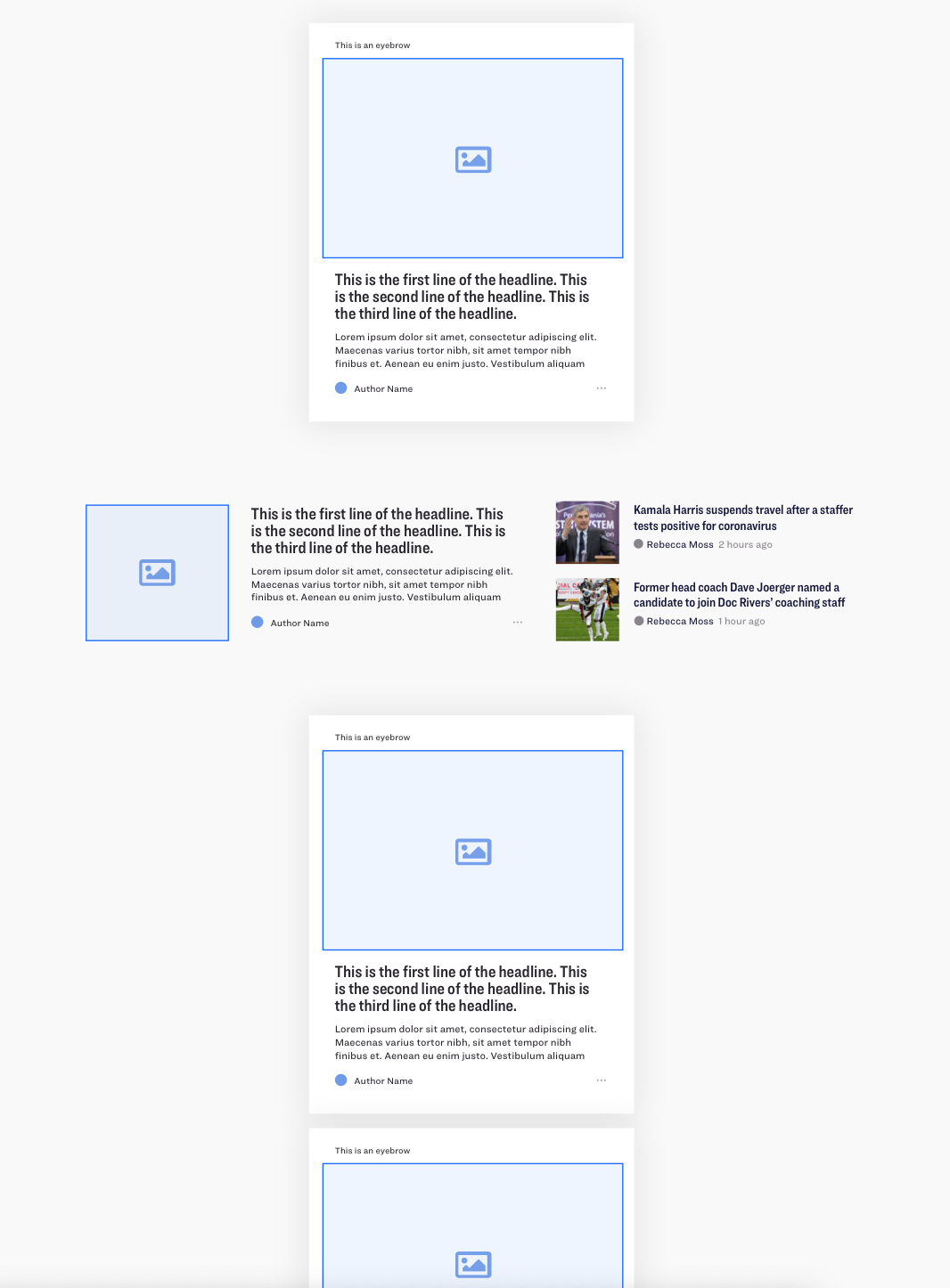
Phase 2: Packages + Feed Combined
Challenges:
These are 2 very different patterns of consumption and it may be a confusing user experience as you scroll down the page. How do we combine a more traditional news experience with our more modern and mobile-first feed pattern?
Opportunity:
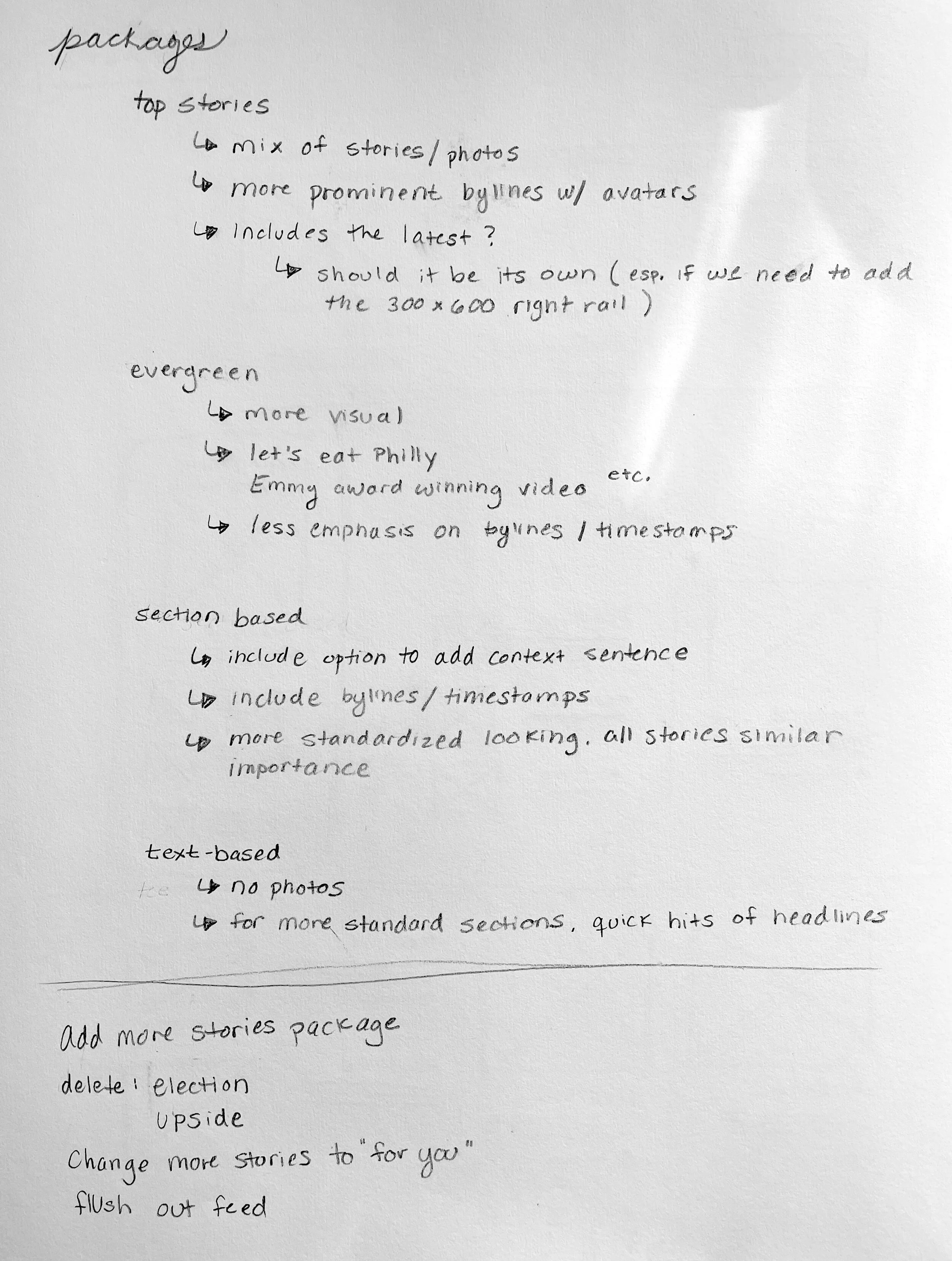
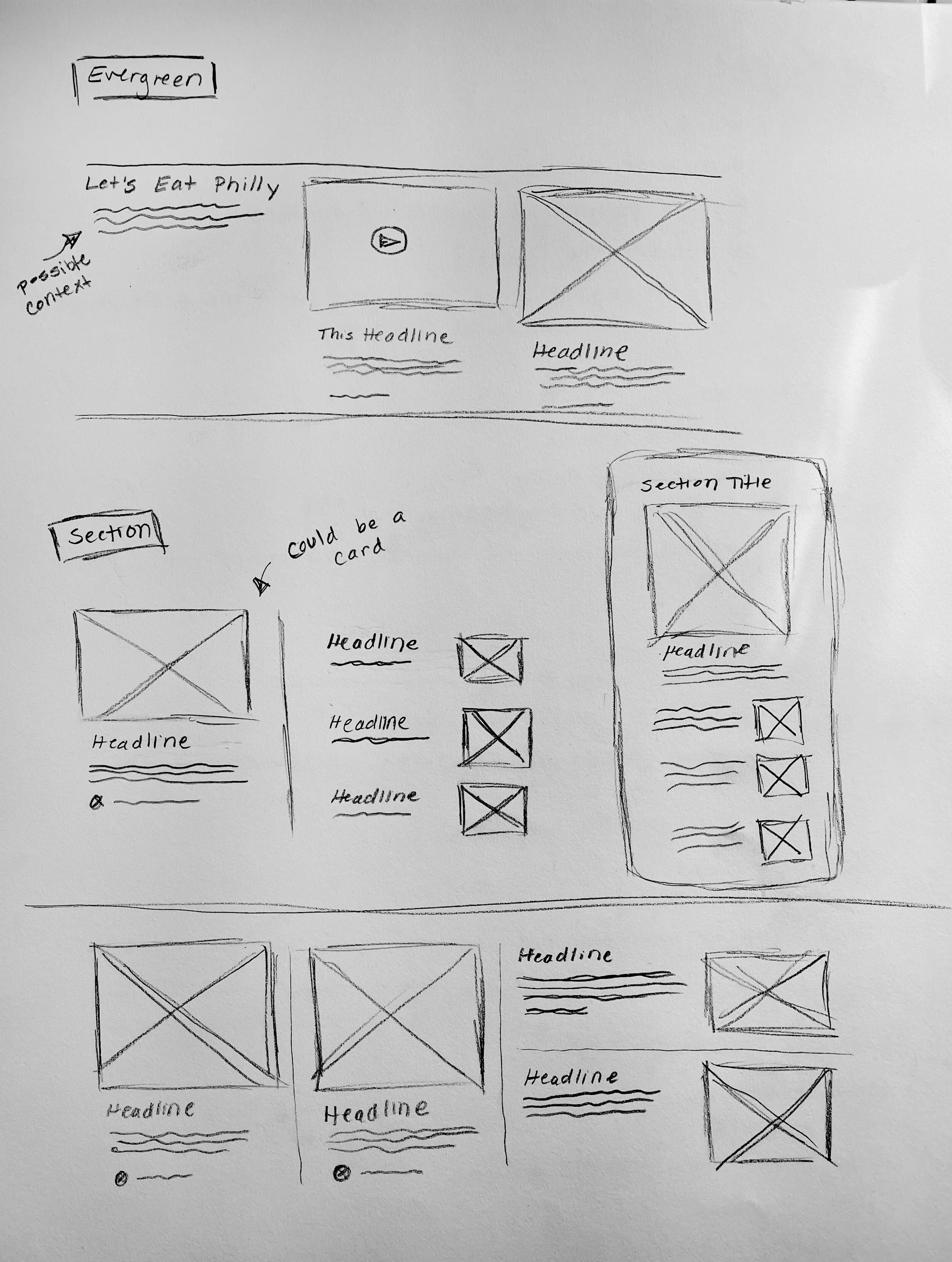
Packages can give our internal producers the ability to be very flexible and curate the best experience for our audience. They also group content so that users can quickly get a sense of the day’s news and also see any additional content that our reporters have provided.
User Testing
We did 4 rounds of user research during our iteration phase. Each round had 5 participants taking part in 1 hour long moderation sessions.
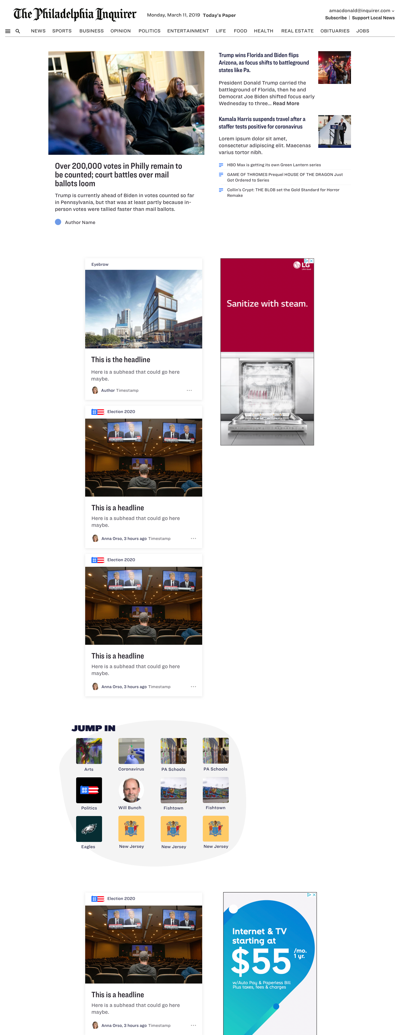
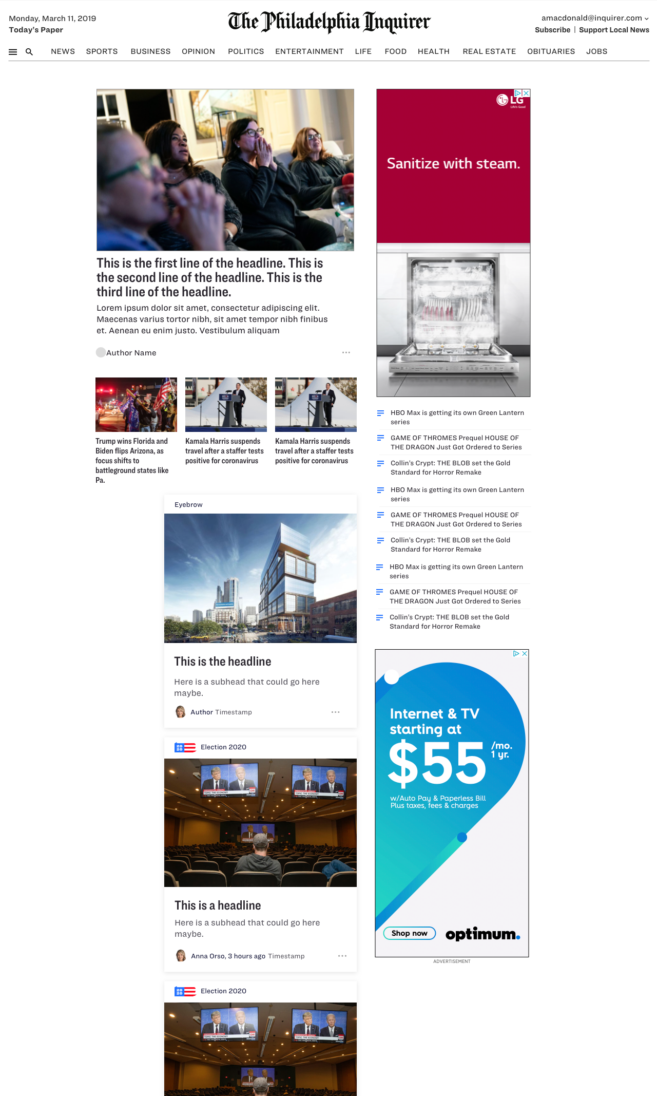
We showed them this concept that included a few packages of content at the top and then moved into a feed at the bottom.
Top Takeaways
The top half of the page was perceived as well organized
People had positive reactions to ‘The Latest’ at the top of the page
People had positive reaction to our navigation/categories, but were confused as to what to find in the hamburger menu
People were unbothered by the advertisements on the page
The feed had a confusing scroll interaction pattern
The feed lacked clear context (“why are you showing me this?”)
A few users were untrusting of ‘algorithmic feeds’
The feed on desktop is a slow way to consume news
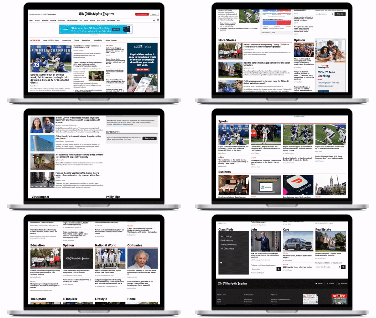
Overall, the design did not test well and the feed was very confusing for users to understand. However, they reacted really positively to the packages and latest headlines at the top of the page so we made a decision as a team to scrap the feed from the homepage and focus only on packages for the homepage redesign. Check it out below :)
Final Design
Results and Next Steps
✅ Desktop homepage saw a dramatic increase in click through rate, improving by 30% overall.
✅ Scroll depth on the Fusion homepage has also improved, along with the CTR further down the page than we saw on the classic homepage.
✅Mobile recirculation continues to improve, largely due to engagement with the feed, and increased usage of the global navigation features.
🟧Mobile click through rate from the homepage has declined, however, the overall recirculation rate on mobile has improved (most likely due to the feed under articles).
🟧Mobile audience is more likely to engage with the feed - but fewer readers have the opportunity to due a lower article completion rate on mobile.

