WHAT IS INK?
Ink is an Internal CMS to manage all aspects of the user experience in the Philly.com mobile news app. This tool allows the newsroom to be better connected to their audience and drive user engagement. I was the lead designer on this project, working closely with the mobile product owner and engineering team.
01. Workflow
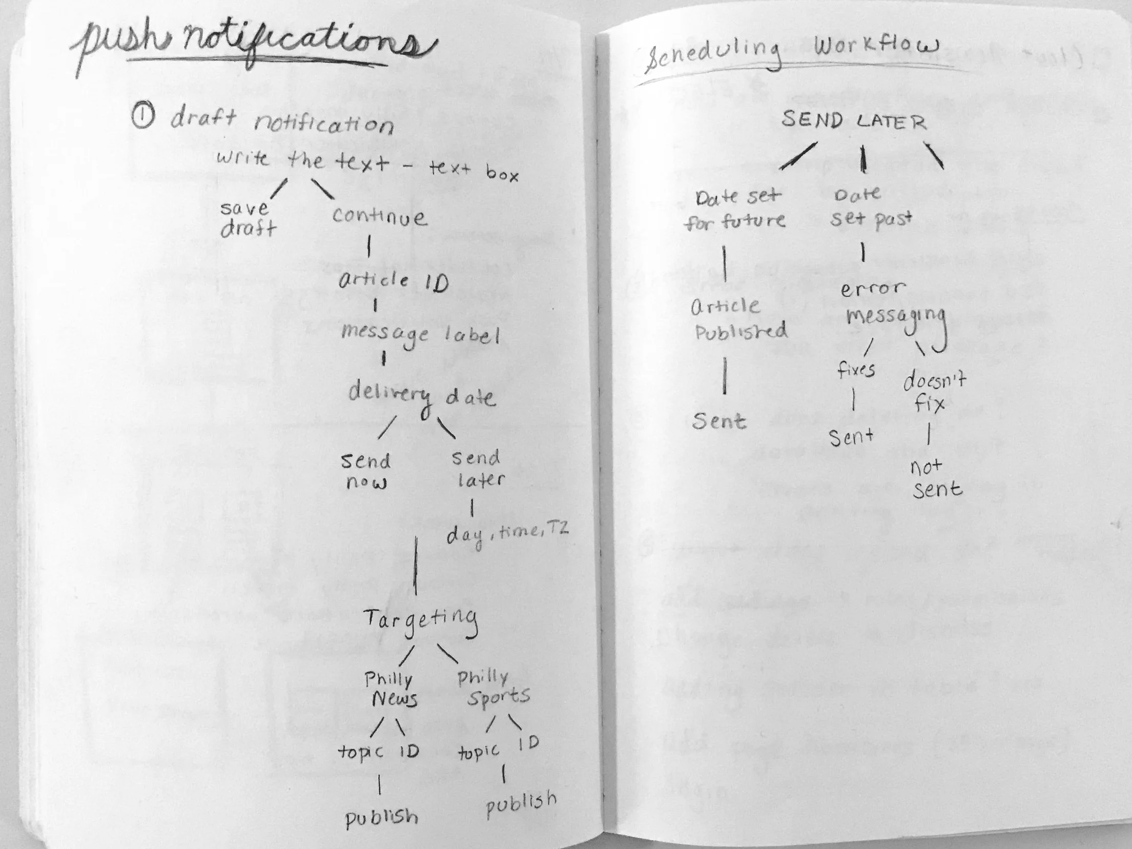
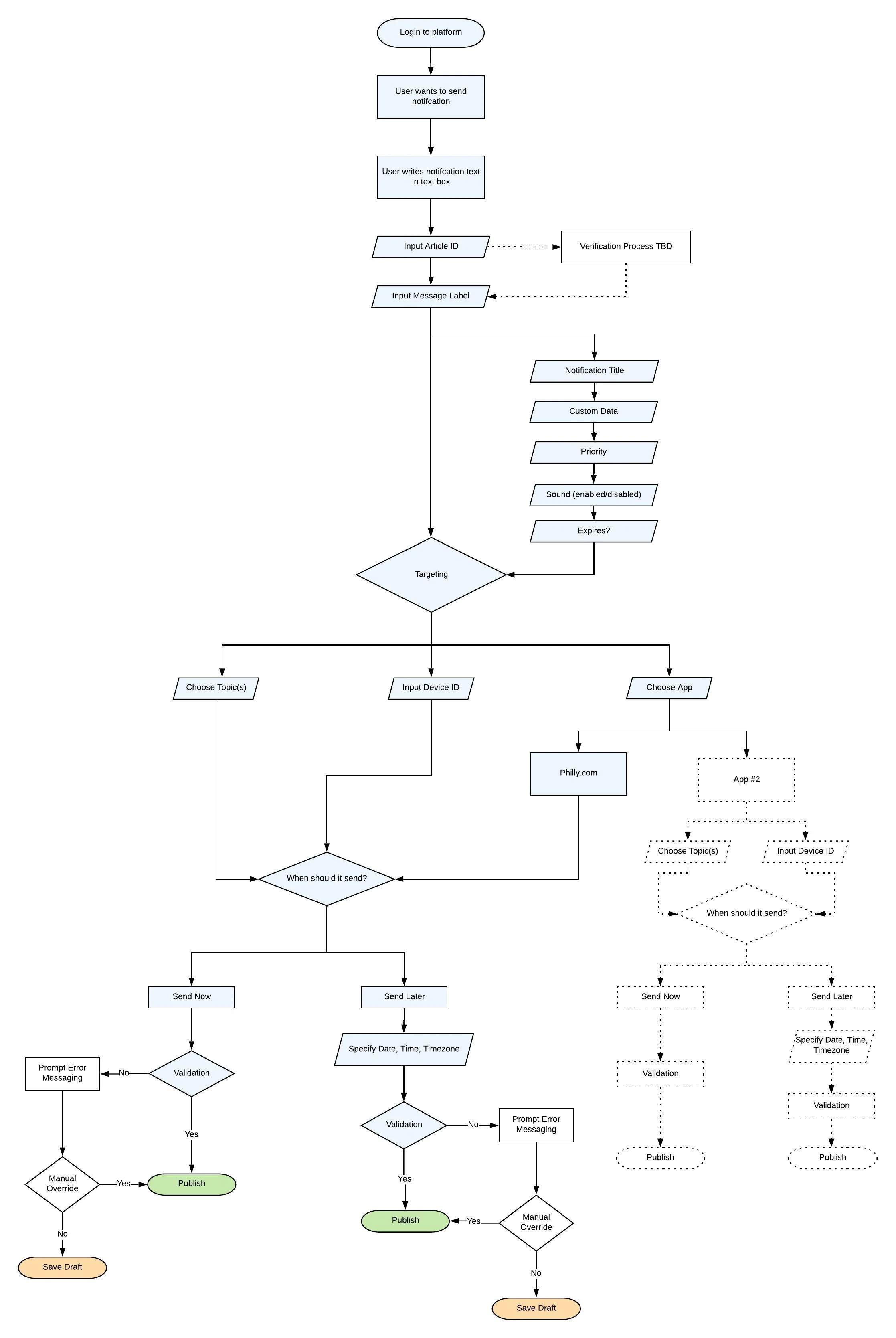
The first priority for Ink was the ability to send push notifications. I began my design process by researching and gathering the requirements with the product owner and identifying the key pieces that needed to be worked through. I broke down the requirements into a flow that included: drafting, labeling, targeting, scheduling. and publishing.
After the requirements were organized, I started to work on the flow that a newsroom producer would follow in order to send a notification. We met with our stakeholder in the newsroom and confirmed that this flow would serve their needs.
02. Discovery
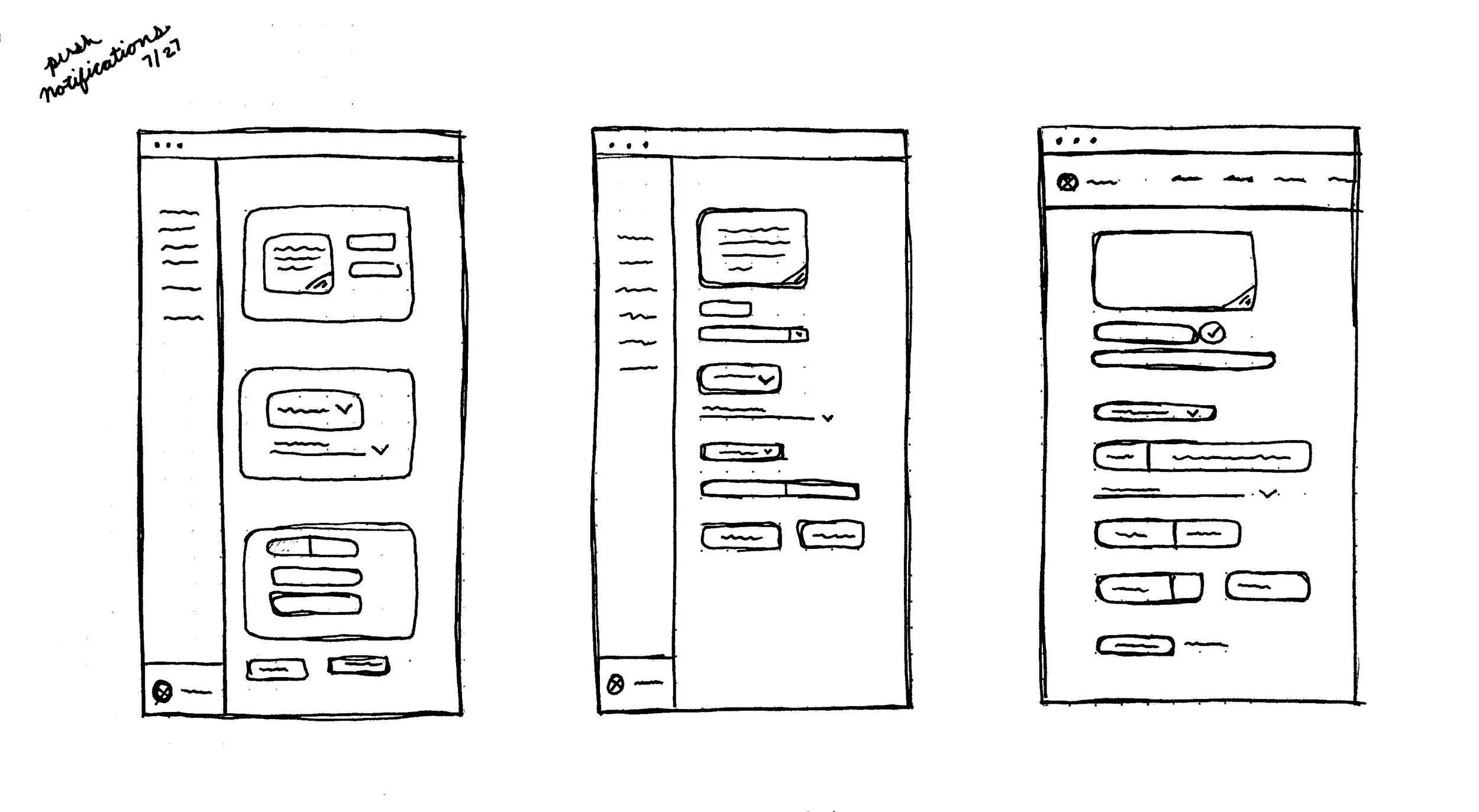
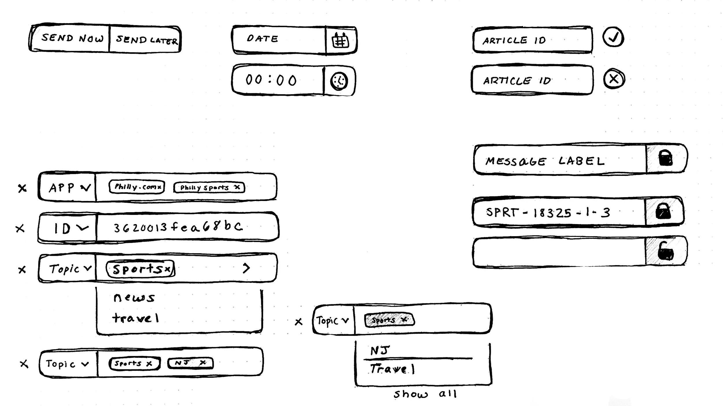
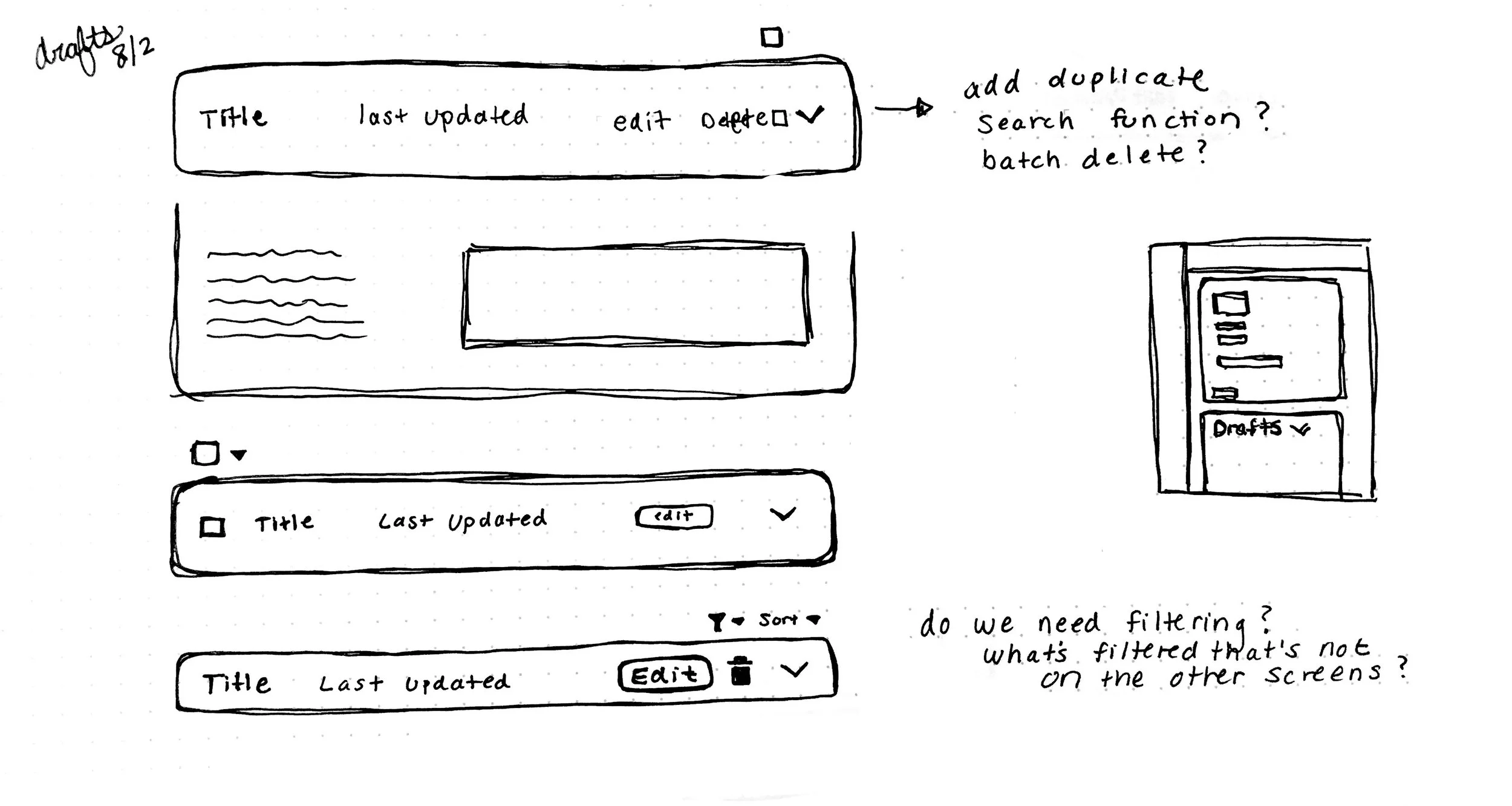
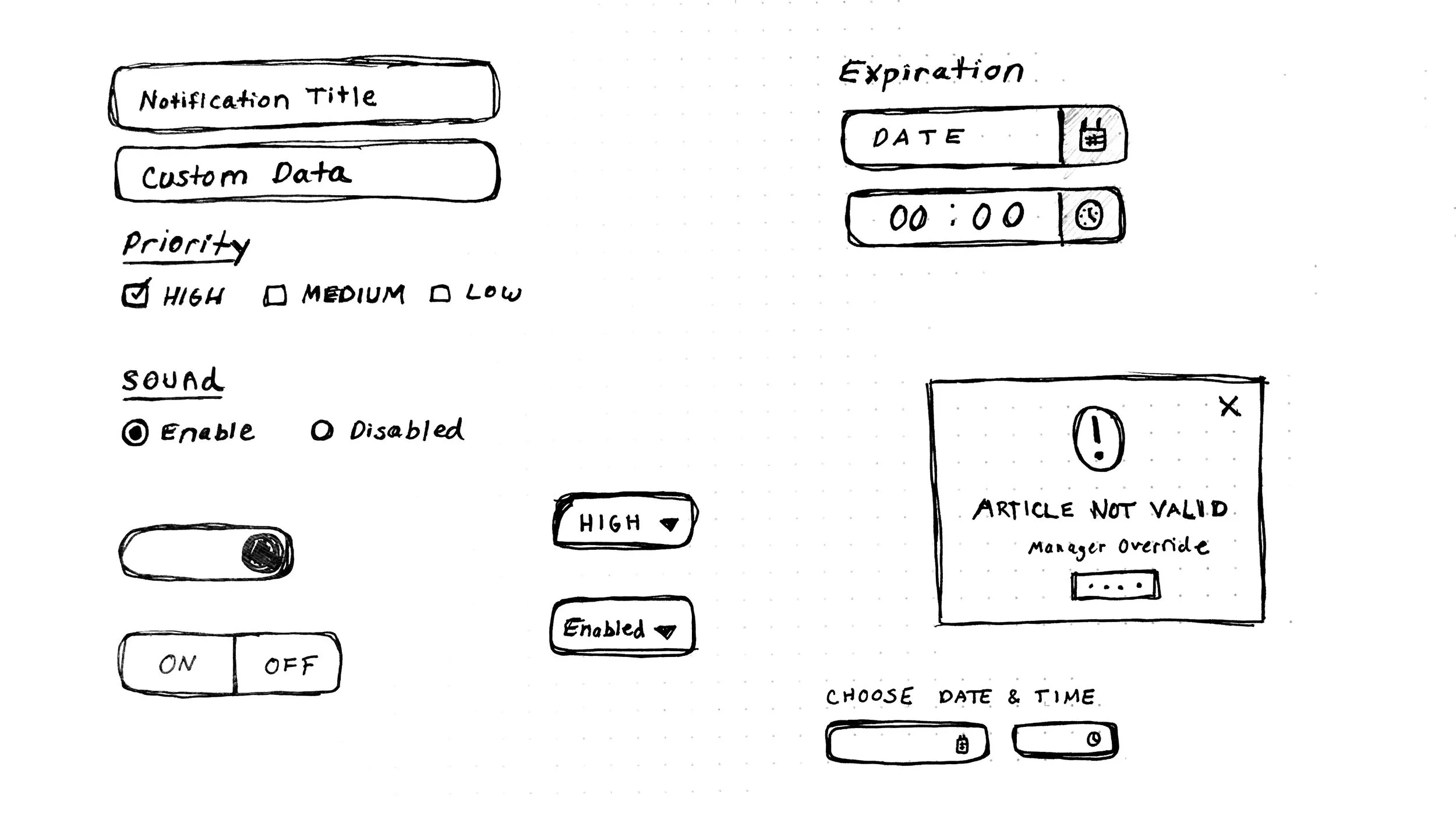
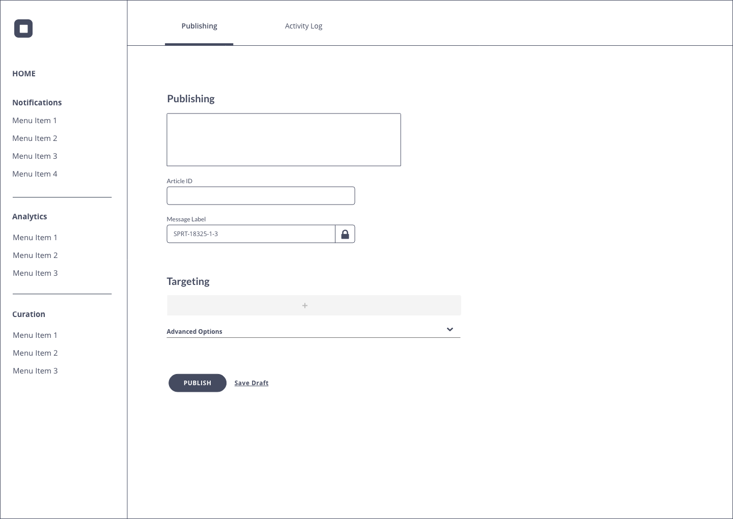
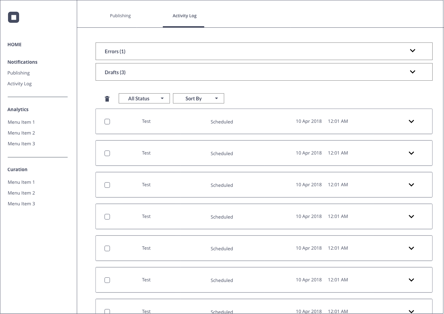
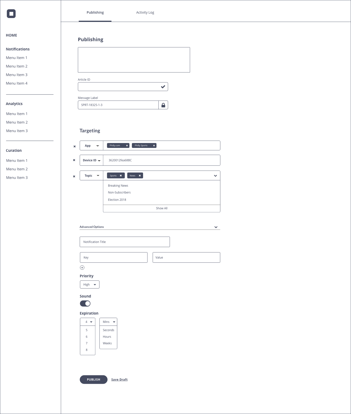
The next step in the process was to sketch and wireframe the feature. I decided on a dashboard interface because of its ability to scale as the team developed new features. I dedicated a lot of time to researching the best UI patterns to fit the needs of this tool.
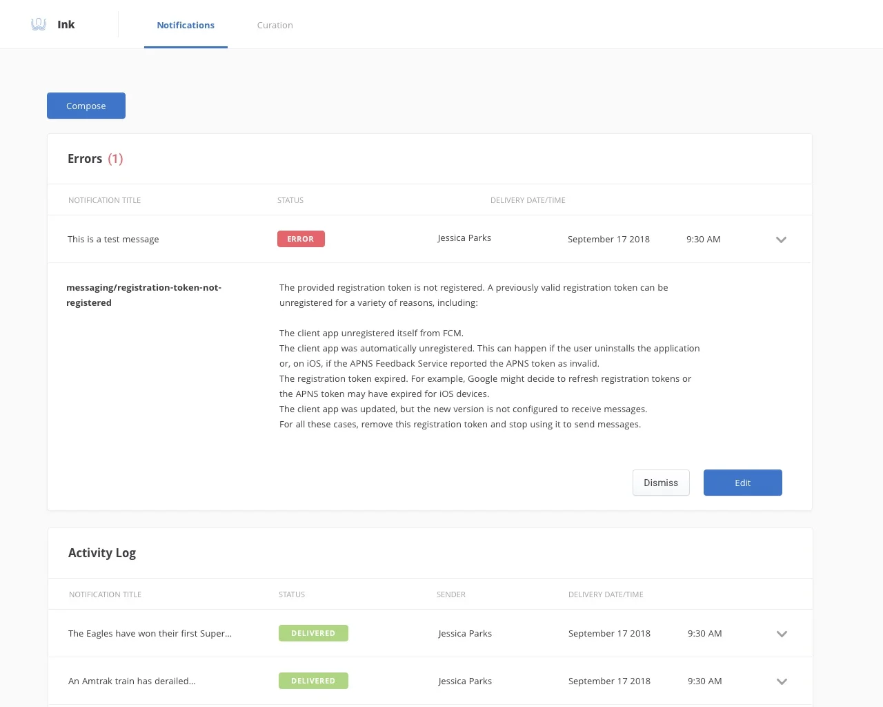
One of the largest problems that needed to be solved in order to effectively send push notifications was validation. From an editorial perspective, they needed to be sure that the notification was accurate, timely and attached to the correct article. One of the most important use cases for push notifications was breaking news. When news breaks, there is not an article that can be associated with a notification and therefore will render an error. The solution that we proposed was that if any error messaging came up, the notification was blocked from publishing until an authorized user entered a manual override code. This allows the newsroom flexibility and helps them reach their goal of informing the public of breaking news.
03. Visual Design
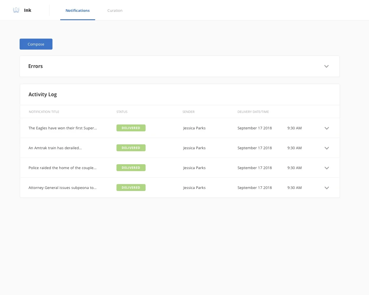
After sketching, wireframing and prototyping the flow, I moved on to the visual design. Ink is an internal tool and therefore I wanted to keep the design very simple and allow for the emphasis to be on the utility of it.
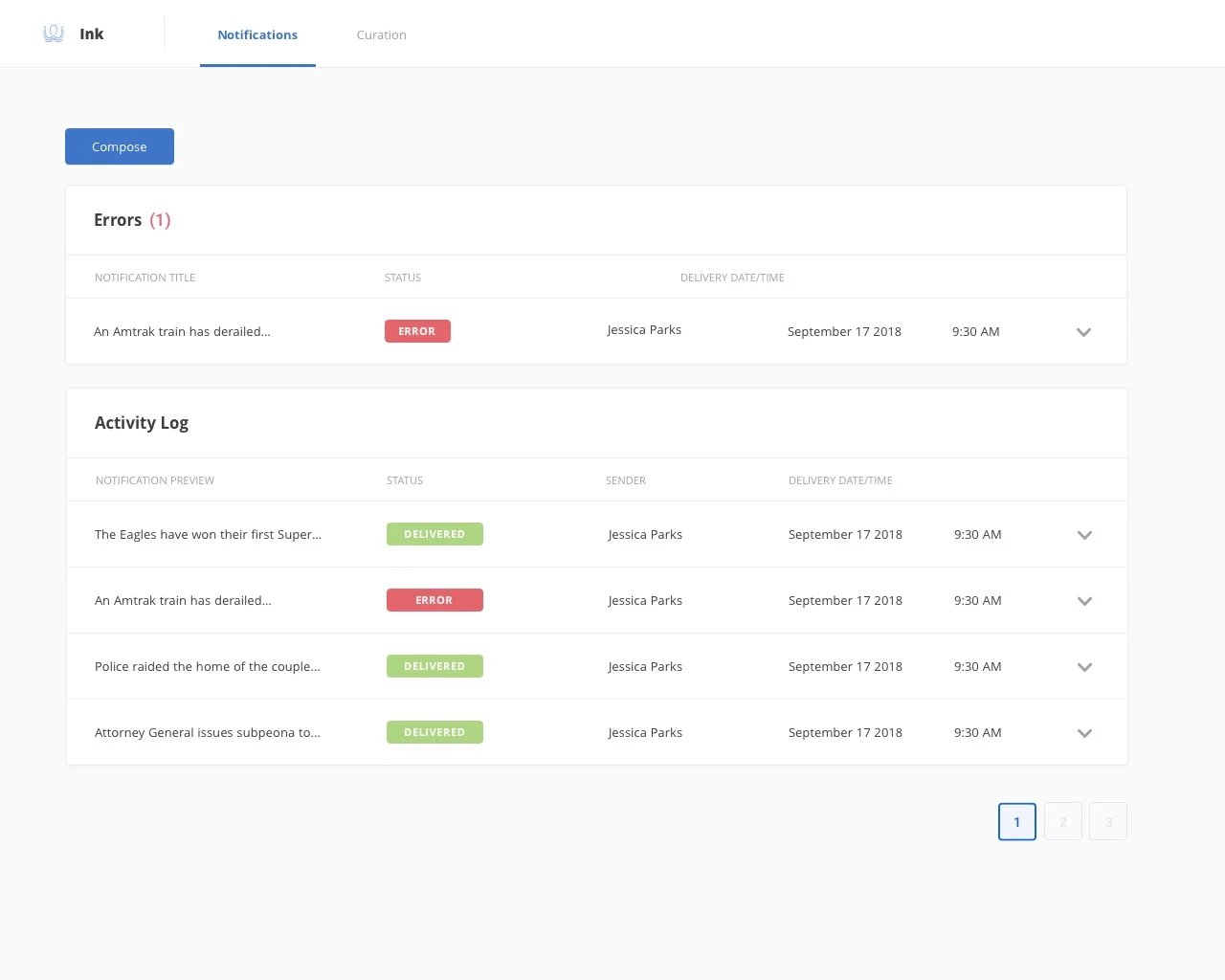
The news happens fast and I made the decisions to allow the labels to stand out so that the notification status was very clear at a quick glance. The design also allows for the notification to be expanded and include more information. This is especially helpful for notifications that are errors because you can start to troubleshoot a solution.

